
By Cat Johnson, CPWA & Senior Frontend Engineer At Khan Academy, our mission is to “provide a free, world-class education for anyone, anywhere.” This ... Read more The post Rebuilding Graphs for Accessibility: Inside Khan Academy’s Inclusive Design appeared first on Khan Academy Blog.
By Cat Johnson, CPWA & Senior Frontend Engineer
At Khan Academy, our mission is to “provide a free, world-class education for anyone, anywhere.” This commitment shines through in our dedication to accessibility and ensuring that all learners, regardless of ability, can access our library of content. But did you know that until recently, learners who depended on a screen reader could not use our interactive graphs? As such, we renewed our commitment to our mission by improving the accessibility of our graphing exercises.
You might be asking, “How do you make a graph accessible?” We’re glad you asked! Let us take you on a journey through how we created accessible graphs that work for everyone.
Why graph accessibility matters (and where we started)
Our initial graphing exercises were based on a very old version of Raphael.js, which is an API that can draw 2D images using SVG. From there, we added a layer of interactive elements that students could drag to complete practice exercises. While this worked well for many students using a mouse, it posed challenges for those relying on keyboards or assistive devices. This meant many students could not complete our exercises without depending on someone else.
As a result, we set out to make our graphs:
- Visually accessible: We enhanced color contrast to ensure graphs are easily distinguishable and accessible for students with visual impairments or color blindness.
- Keyboard accessible: This allows students to use their keyboard to move points and update graphs to answer questions.
- Screen reader compatible: This enables students to use their screen readers or other assistive devices to interact with our graphs.
To do this, we rebuilt our graphing exercises using Mafs, an open-source React component library designed for interactive math experiences. This allowed us to leverage React’s dynamic, stateful UI capabilities and ensure a more maintainable experience. Importantly, Mafs components are built with keyboard accessibility and assistive-technology support in mind, giving us a strong foundation from which to build.
Challenges we faced (and solved!) when making graphs more accessible
While Mafs solved a lot of initial challenges, rewriting a core experience like our graphs is never without obstacles. We encountered and solved many fun and interesting problems as we worked to balance accessibility, usability, and performance.
One major challenge we had was ensuring robust screen reader descriptions and notifications of the initial and changing state of our graphs to help students complete exercises. These dynamic notifications include, but were not limited to the following:
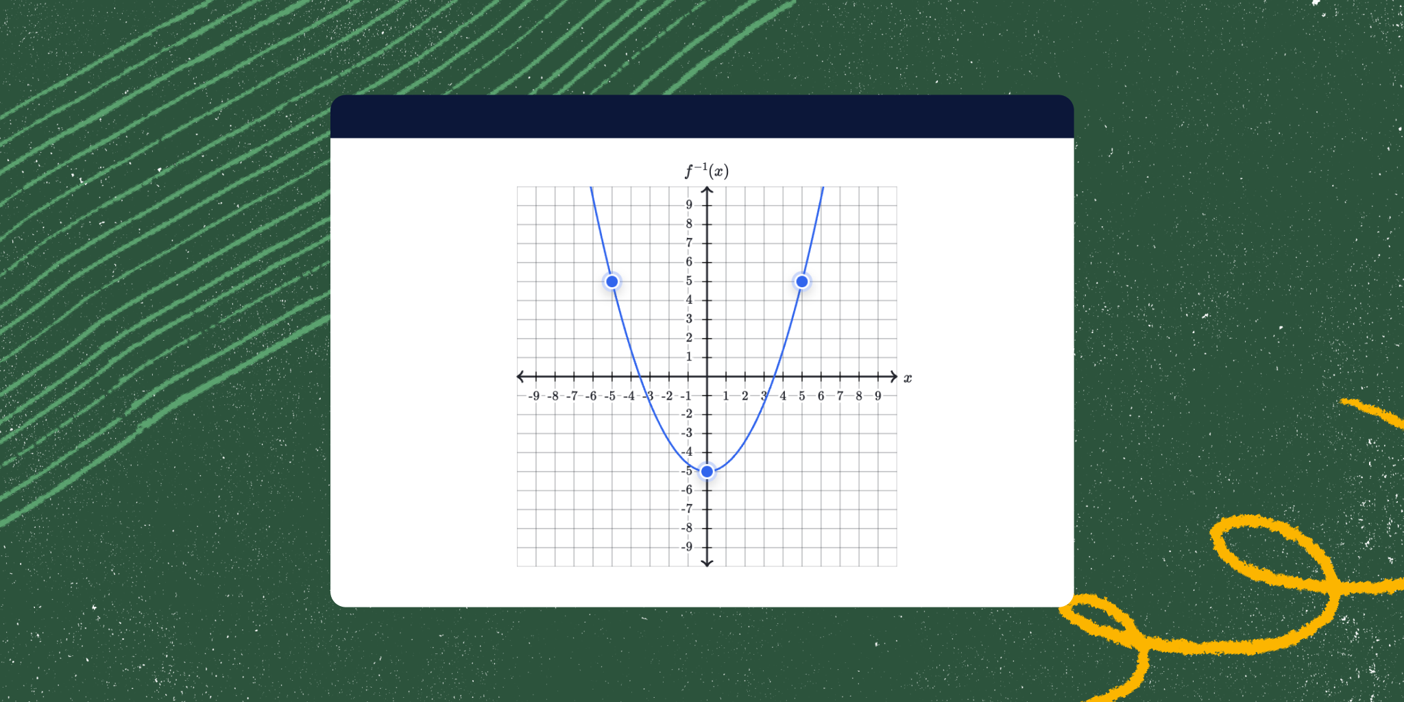
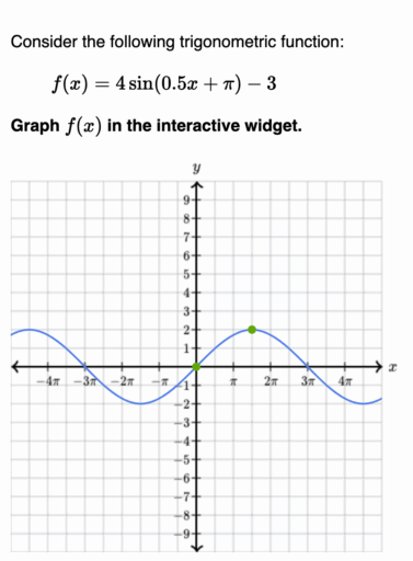
- A description of the visual representation of functions on our graphs, including:
- Quadratic
- Sinusoidal
- Linear
- and more
- A description of static elements in the background of the graph
- A description of changes to a point’s coordinates, a circle’s radius, x or y intercepts, and other interactive graph elements.
- A semantic HTML role that appropriately represents the movable elements of the graph (Trust us, this is quite challenging.)
- and other notifications, depending on the graph
This ensures students have access to all visual graph information to answer questions and engage fully in Khan Academy exercises containing graphs.
And don’t get us started on the challenges we faced getting our rendering of TeX (a document markup language) through MathJax (a JavaScript display engine for mathematics) to work Mafs. Let’s just say it entailed using something we called a “Mafs Sandwich”—and we will leave it at that.
Overall, our engineers had a lot of fun using our courses to relearn graphing concepts in order to ensure we were correctly updating graph functionality—and avoid breaking the graph. (We’re looking at you, polygons and angle graphs)..
What accessible graphing looks like at Khan Academy today
Today, our graphing exercises have dramatically improved. Any student can use their keyboard to navigate graphs, move coordinates, adjust circle radii, draw polygons, build scatter plots, and more. In addition, when we tested our new-and-improved graphs with screen reader users, they were delighted that they could make shapes, move points, and do anything a mouse user could do!
Our graphs were, and still are, a collaborative effort between design, engineering, and content teams dedicated to creating a rich, accessible learning experience.
Graph points (practice) | Coordinate planeIf you encounter any accessibility barriers or have suggestions, please reach out by doing either of the following:
- Submitting feedback on our website at Submit a request – Khan Academy Help Center
- Emailing us at [email protected]
And if you use assistive technology and want to participate in research, please reach out by:
- Emailing us at [email protected]
Thank you for being a part of this journey!
The post Rebuilding Graphs for Accessibility: Inside Khan Academy’s Inclusive Design appeared first on Khan Academy Blog.